OOKA
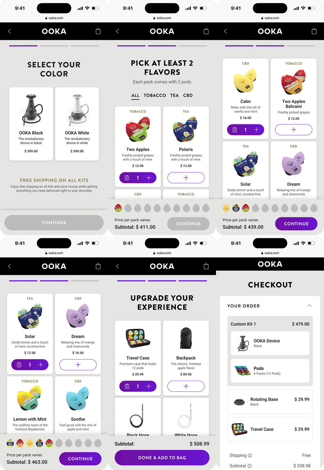
The challenge was to create a design that effectively introduced a new B2C product to the market. The design focused on a clean, intuitive interface that guides users effortlessly from product discovery to checkout.
Overview
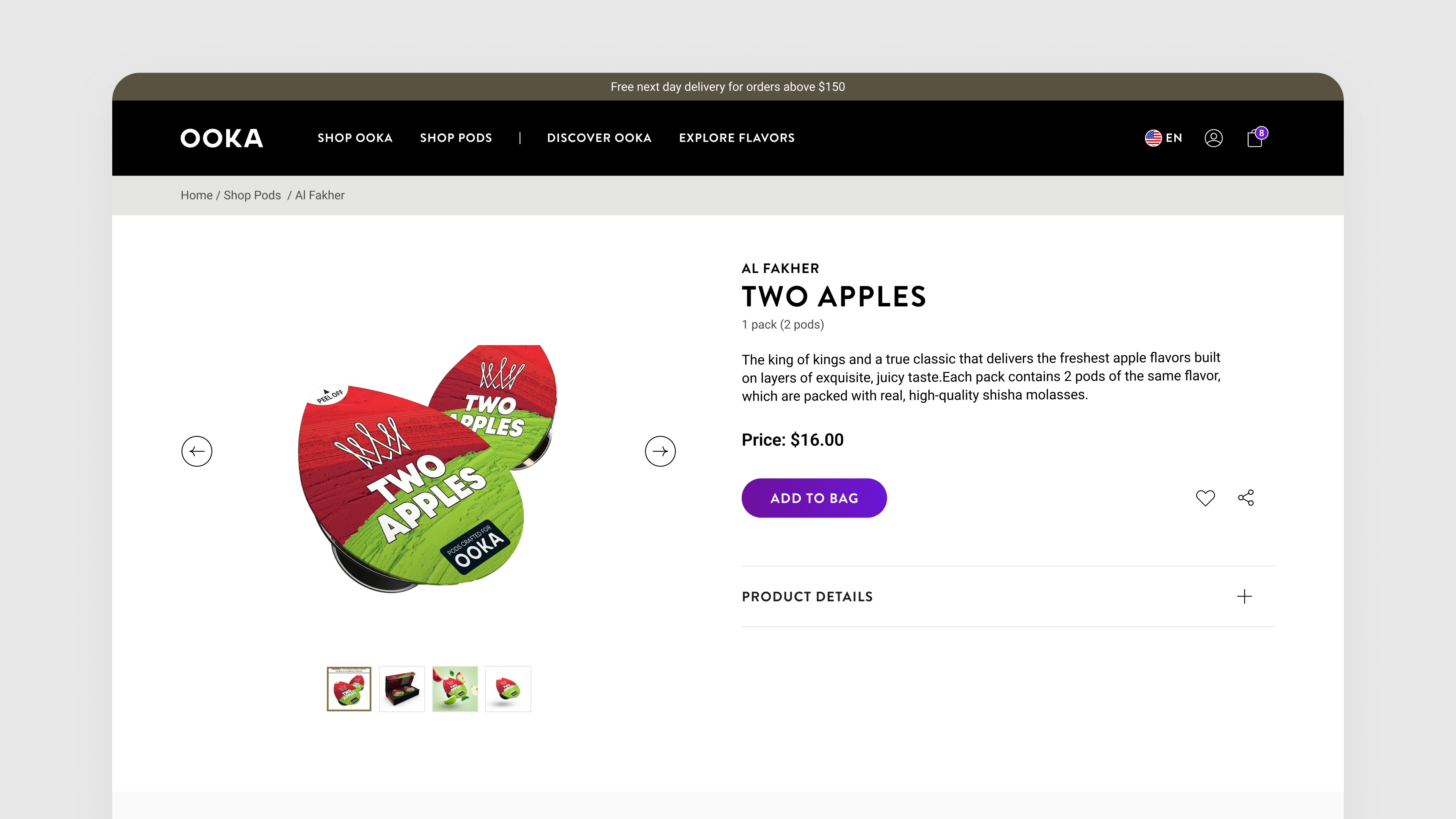
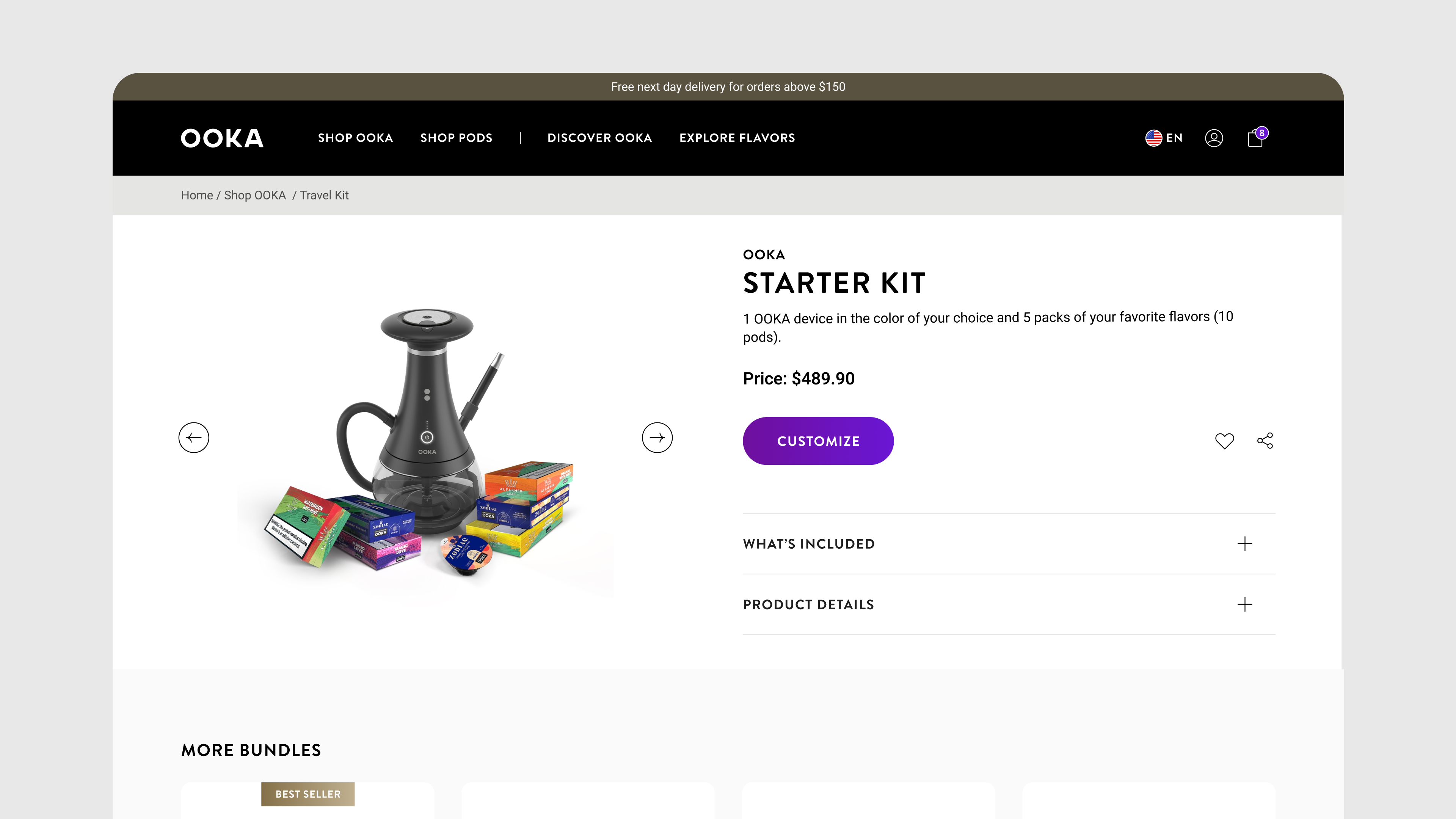
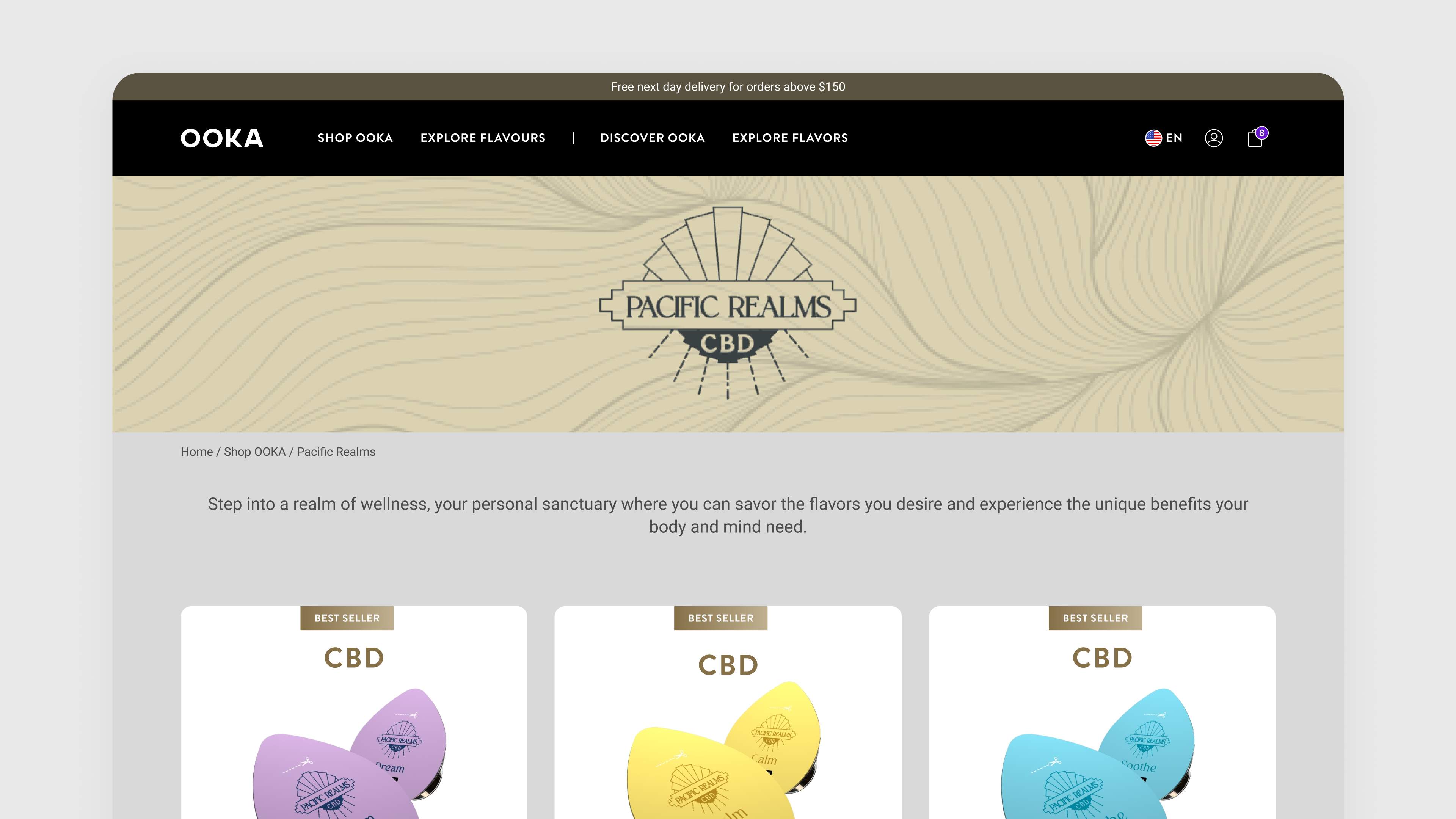
Ooka is an electronic hookah device that comes from the UAE and has started to expand into the U.S. and Germany. Through its platform, users can buy devices, accessories, and flavored pods.
One of the biggest challenges in this project was reconciling the different demands from various teams, such as product, branding, and legal while keeping in mind all the best practices from a usability perspective.

Checkout flow
The checkout experience was meticulously crafted to ensure customers glide through it smoothly—no bumps, no fuss, just pure seamlessness.
Say hello
hello@greatersum.studio
+358 44 933 1814
Find us
Eerikinkatu, 28, 00180, Helsinki
Business ID
VAT: FI34419387


